Talking Type
Talking Type is the first blog post in a series that will be written by our team members. We’ll each share things that we love or nerd out about outside of our work life that bleeds into our professional roles. This first post was written by Logan Hamilton Acton, our Creative Director. He’s a member of the Association Typographique Internationale, Type Directors Club, and The Typographic Circle. To say he geeks out about type is an understatement. Read below to learn a bit more about Logan’s passion and gain some high-level enlightenment.
Type in Action
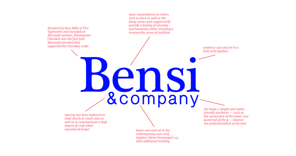
Type and lettering are some of the most powerful, and often subliminal, communicators of meaning. In my role leading brand development for clients, I am able to put my passion for typography into action as our team works to ensure that all public communication reinforces a company’s core values and effectively supports its goals. At times this may take center stage — when designing a logo, for instance, which will be replicated nearly endlessly and come to be all but synonymous with that organization. In these cases, it is crucial that the typographic and symbolic content efficiently identify the business they represent, encapsulating its essential voice.

For everyday situations, the role typography plays tends to be quieter — one more piece of the brand puzzle that an audience feels but does not actively think much about. Far from diminishing its importance, in fact this drives us to do our very best to be sure our clients are using all the tools in their belts to communicate their core messaging. If a campaign aims for ‘friendly’ and a type treatment feels foreboding, we are already fighting an uphill battle. While there is no one right font for a particular purpose, there are most certainly better and worse options. Getting it wrong won’t ruin your business, but standing out with the same care and craft with which you make every business decision? That can be a powerful differentiator and one more way our team loves to help our clients succeed.
On Structure and Stability
Typography is a special thing. While letterforms have changed a great deal since the innovation of moveable type nearly 600 years ago, their structure is remarkably constant. Language is a living entity, no doubt — malleable and constantly evolving as new words enter common usage and others are yearly removed from our standard dictionaries. Within the Latin alphabet, however, the letters that comprise these words remain nearly unchanged through centuries of technological and cultural innovation.
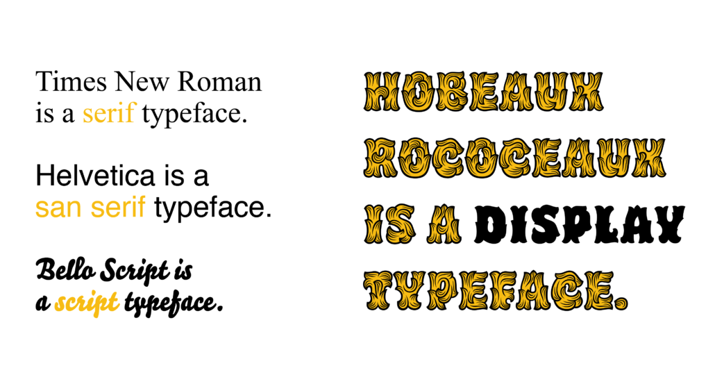
Surprisingly (or perhaps inevitably, given such wide variation) there is no official system of type classification. Different attempts have been devised to help categorize typefaces, to various degrees of usefulness. Broadly speaking, the most familiar terms for most people will likely be the four big buckets which are commonly used to organize more detailed subdivisions: serif, san serif, script, and display or decorative fonts.

Put simply, serif faces are those we often encounter when reading books and include the finishing strokes on the top and bottom of letters, called serifs. Times New Roman will be familiar here. San serifs generally follow the same approach, but omit the serifs in favor of a simplified and more direct form — the star of its own well-known documentary, Helvetica might come to mind. As their name implies, scripts recall the process of writing and popularly find themselves in logos or formal invitations rather than used for large bodies of text. Finally, display or decorative fonts include a massive range of expressive designs intended for limited application at large sizes.
The Seduction of Form
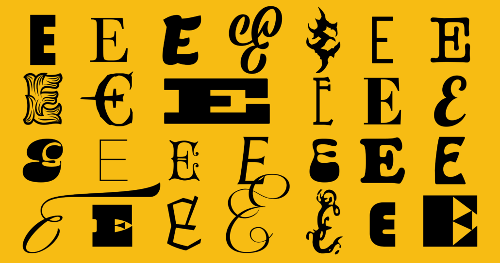
While the structure of letters has proven highly durable, within (and to the limits of) these boundaries is plenty of space for endless innovation. We are able to easily discern the letter “E,” for instance, in its simplest and most unadorned san serif form to its most elaborate script and display varieties.

Sometimes, the richness of character may be felt more than seen, registering through the overall ‘texture’ of a piece of writing rather than through the specific elements of a given letter. This is particularly true of fonts used for setting body copy, or large amounts of text. In this case, smaller sizes and the way we read words rather than individually identify letters mean that we don’t (and arguably shouldn’t) pay attention to the details but instead focus on the content at hand. Beatrice Warde famously asserted this exact point in her essay “The Crystal Goblet, or Printing Should be Invisible.”
At larger sizes, however, something somewhat magical happens and the forms of a letter have the power to be monumental, graceful, even unfamiliar. Outside design there is also no shortage of artists who have been captivated by the abstract forms of lettering or the visual dynamics of calligraphy. Ellsworth Kelly, Franz Kline and many other artists dedicated much of their careers to such an exploration of form. And you will, of course, find all manner of type enthusiasts within the ranks of designers and collectors of type specimens, those beautiful publications intended to showcase (and sell) collections of letters. Although the practical function typography serves in visual communication is critical, its expressive, emotionally rich potential makes good business sense in differentiating a brand. Maybe just as important, the beauty of a well-crafted form offers a moment of pause and appreciation in our increasingly complex world.


